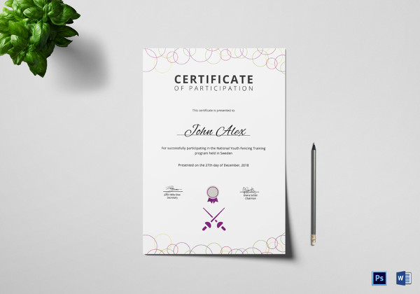
As professional certificate is known as a document that serves as a written testimony of qualification or a fact, most of the business settings and training centers design and present certificates to recognize an individual’s achievement in a specific skill or to certify that he/she is now highly skillful to perform a specific task or job. Creating professional looking certificates to use in annual award ceremonies is a superb idea to let brilliant employees know that you are aware of their abilities and highly appreciate their efforts even without spending a lot of bucks. It is a simple yet most effective way to give them the recognition they really deserve.
Hiring a professional designer to create such certificates can be little bit expensive for your business or company. However, you can design them by your own with help of easily editable certificate templates that can be downloaded from the web. Whether you are about to recognize an employee for his/her loyalty and services or want to certify an employee for his/her creative professional skills, below we have listed some secrets to create professional looking certificates that your employees will display proudly and keep at home as professional keepsake for years.
Choose an Apt Color Scheme
Creative use of colors when designing a certificate can make it simply appealing. There is no one size fits all method when creating professional certificates but you will need to use bright colors like neons and pastels to make your workplace related professional certificates look great. When making certificates for your employees to appreciate their efforts, then stay away from dark and loud colors and stick to more traditional blacks, greys and blues on white paper make them pleasing to eyes and professional as well.You can also use corporate colors (colors that appear in your logo or branding) to brand your certificates accordingly.
Don’t mess the Certificate Layout
There can be a lot of things to work with when designing certificates yourself. You will also have plenty of borders and designs to make layout of the certificate appealing, but you shouldn’t clutter the layout with ugly and unprofessional border arts. You can also consider Free Professional Certificate Samples to get unique certificate designing ideas to personalize your certificates accordingly. Creative use of the white space on your certificate design can make it look appealing so try to use information and details that are necessary.
Use Fonts Creatively
Use of different font styles is common when designing a certificate but you shouldn’t overdo it when designing professional certificates for your employees. In order to be on the safe side, sticking with the three font rule would be a great choice for you. Excessive use of fonts can make the overall appearance of certificate messy and hard to read as well. That’s why, always use a fewer fonts for designing professional certificates to make them pretty and easily readable as well.
Include the Proper Authorities
Chances will be there that an employee may have a little or no contact with the higher authorities or management, but getting a certificate signed by the authorities can evidence to be valuable. So, be careful and include the name of right authorities in the certificate to make it more professional and authentic.
Check for Typos and Spelling Errors
Wrongly spelled name of the recipient can be disappointing for him/her instead of making feel contented. That is the reason experts always suggest rereading of the certificates before final printing in order to prevent typos and spelling errors and mistakes. Take a close look at the certificate draft to make sure everything is fine and precise as well when presenting your employee or a business partner with professional certificate. If you are not sure about the correct spelling and other details of the recipient, never hesitate to ask for the correct details and info.
Chose the Right paper for Printing
Quality of printing paper can play a vital role in making your certificate professional. Selection of lightweight printing paper for your certificates can feel slight and can also give a bad impression that the recipient isn’t much valued by the organization or company. Hence, using strong and heavy printing paper to print your certificate can have more positive effect to make the recipient feel contented.

