Content is king. You’ve probably heard this saying already. Well, guess what? It’s a lie.
The reality is that if your design sucks, it doesn’t matter how great your content is, no one is going to read it.
This is why it’s so important to make sure that your design is beautiful, clean, and eye-catching.
One of the ways that you can improve your design is adding a content slider do your website.
Here are 10 examples of outstanding content sliders…
#1 Flower Shop

This slider is just one of the 100+ pre-made sliders that you get with this WordPress slider plugin by NextEnd. It has a call-to-action button which stands out from the overall colour scheme (this is very important if you want to get people to click on it!). You can navigate the slider by either pressing the “Next Offer” button or one of the bubbles on the left. The overall design is sleek and beautiful!
#2 Open Society Foundations
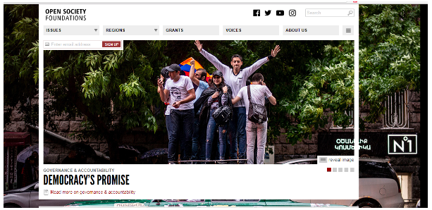
Open Society Foundations’ slider is particularly interesting because the background image and the slide image are one and the same, which makes sense, because it focuses the visitors’ attention to the visual representation of a particular social issue. A picture is worth a thousand words, right?
#3 Regent College

Regent College’s slider an interesting combination of the static and the dynamic. Most of the slider is static meanwhile the images and the black box with text is dynamic. This allows the visitor to learn more about the college without getting distracted with too much going on at once.
#4 Mr Money Mustache

Mr. Money Mustache’s slider is simple yet elegant at the same time. It’s a great way to quickly direct new readers towards the most popular articles on the website. Also notice how in addition to the usual navigation bubbles there are also navigation arrows which make the slider easier to use.
#5 Design Royale
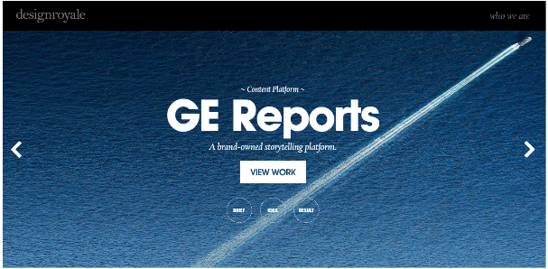
Design Royale’s slider is very minimalistic yet effective. The eye is immediately drawn to the call-to-action button “View Work” which stands out in the blue background. The navigation of the slider is also very straightforward.
#6 Cure Violence

Cure Violence’s slider, with its lively and eclectic colour scheme, is another slider that uses images to represent the social issues the organization is tackling.
#7 Gaillard Foundation
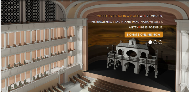
Gaillard Foundation’s slider is really well done. The images convey the atmosphere of the place, the text drives their message home, and the call-to-action button is prominent. What’s not to like?
#8 Jason Bradbury

Jason Bradbury’s slide is very original. The images are great, the colours are great, and it dominates the entire homepage! Outstanding!
#9 Fastfender

Fastfender’s slide is interesting because they use the slide to show off their products (numbers on the bubbles represent different hangers).
#10 Berkshire Salon Day Spa

Berkshire Salon Day Spa’s slider is unique because it has no text, only images, which are used to convey the experience you’ll have if you visit their spa. It’s rather unusual… But why not?
Conclusion
It’s true that content sliders are a controversial topic in web design circles. Some people love it. Some people hate it.
However, they can really liven up your design, and make it easier for you to convey your core message to your visitors.
So don’t hesitate. Add one to your website. Just make sure it matches the overall design well!
